The Laughing Zebra

thelaughingzebra

This is the third project I did with my 3rd-6th grade class on Charlie Russell. After watching some youtube videos on Charlie Russell and talking about his life and art, I had the kids illustrate a letter telling someone about him (like he often did when corresponding with friends), using soft watercolors and Western images. They turned out great and the kids really enjoyed this lesson. They decorated the envelopes as well with colored pencils and we mailed them for the final step.

First they did a rough draft on a scratch piece of paper, and then did a final draft on a  piece of watercolor paper cut down to a letter size. They drew in some guidelines in pencil to help keep their writing straight. We used a extra fine line Sharpie for outlining the pictures and the writing.

*See my step by step instructions, supply list, and more photos in my upcoming book (click here for more information).

Please refer people back to this site if you use this lesson! 🙂

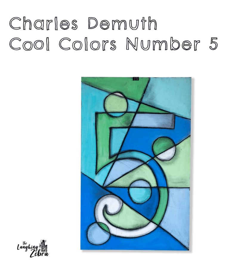
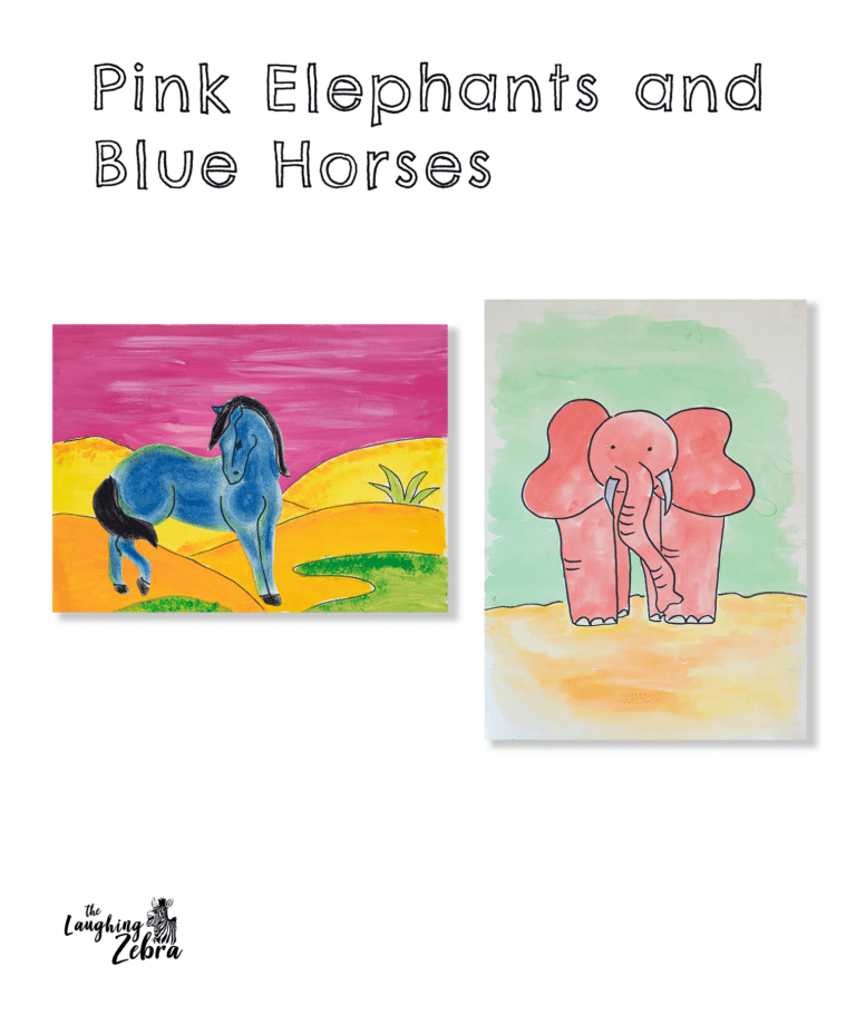
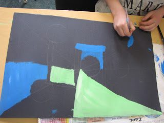
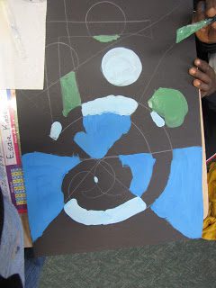
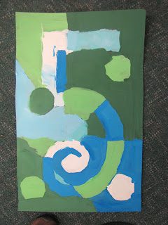
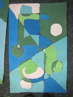
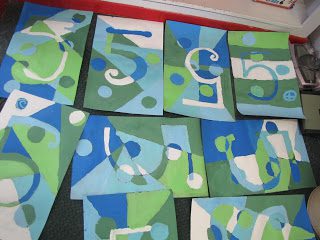
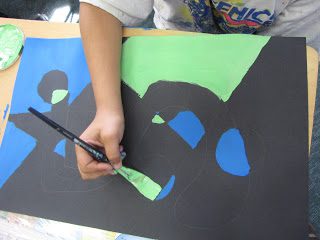
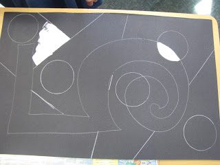
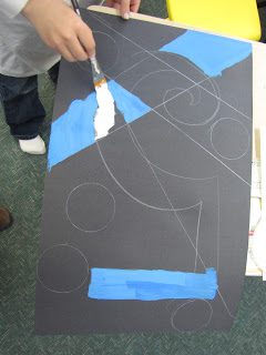
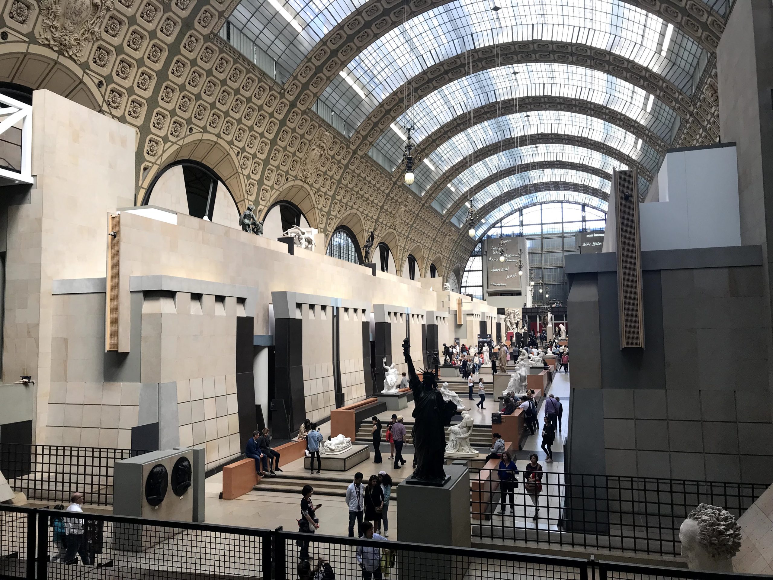
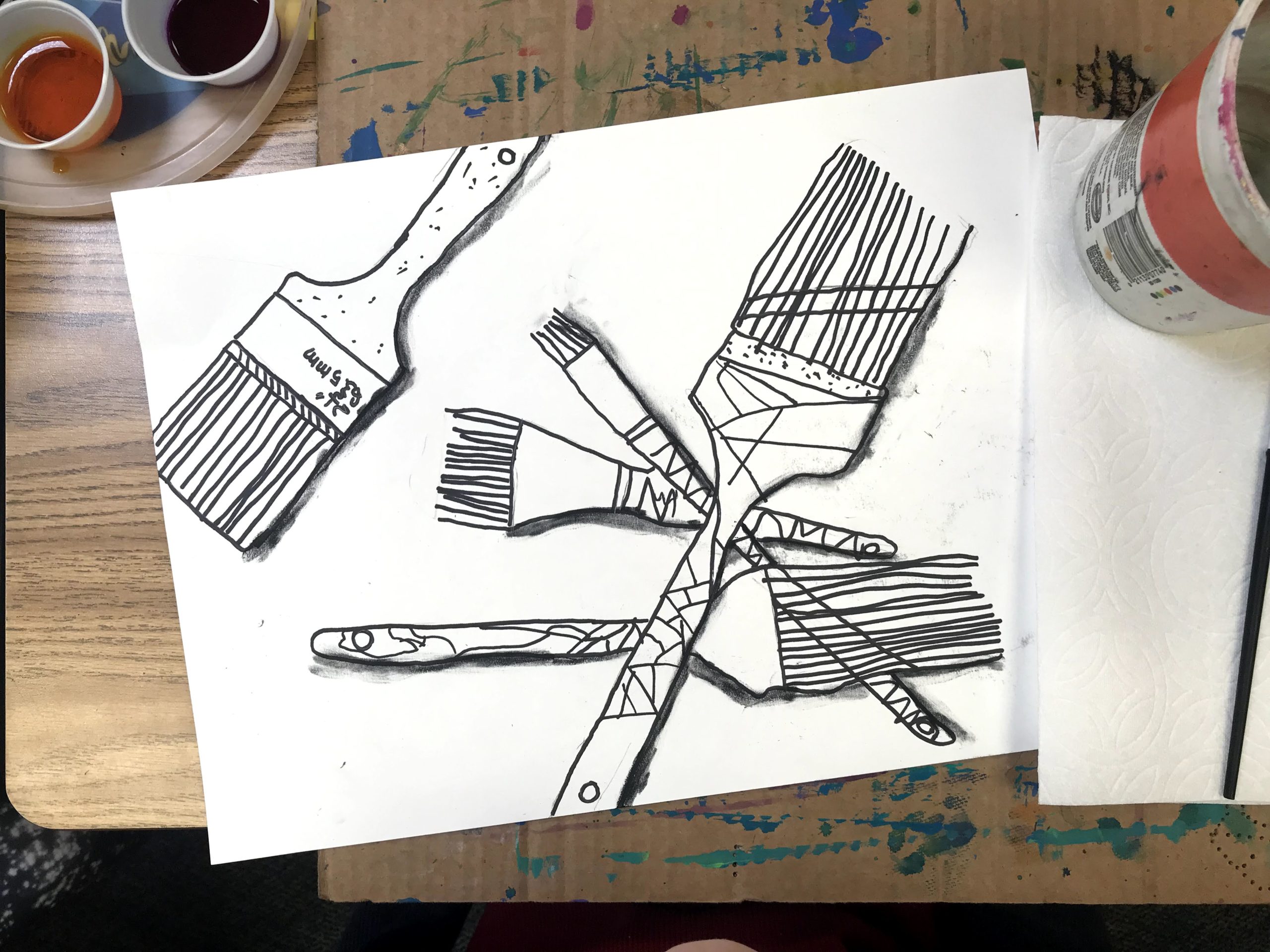
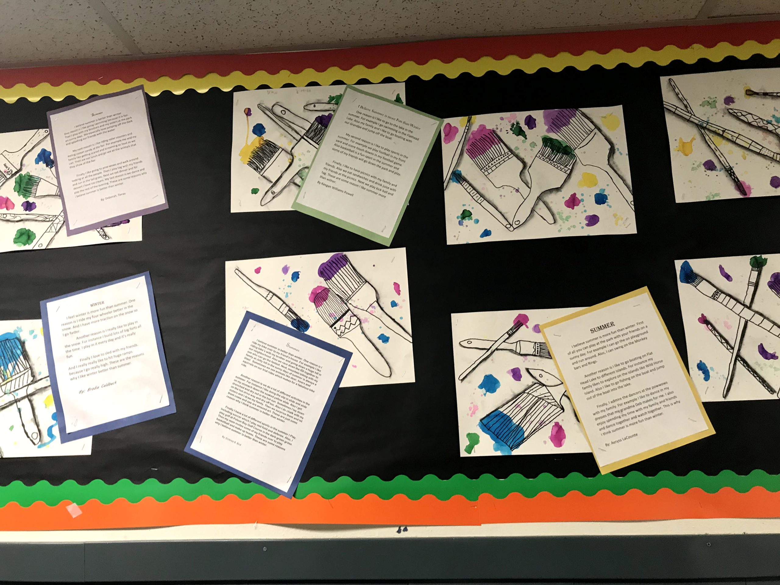
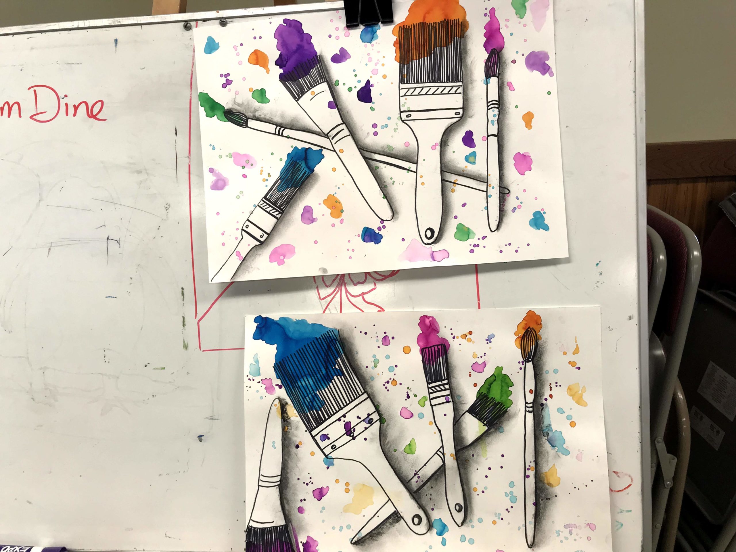
Fun and easy Charles Demuth art project! I did this with a bunch of different ages and they all turned out great.

I’ve been buried in art classes and prep work and haven’t had time to sit and blog a lesson lately. This is one I did two weeks ago at one of the schools I work at. I have been captivated by this print by Charles Demuth for a long time, because I love the use of numbers and text in art. There are many lessons you could do based on this print — I came up with this one because I had just finished another project using black paper and cool colors and it turned out great (It was a portrait of Medusa). So, I thought why not the number 5? 

I did this project with grades K-5. For the Kindergartners I drew the number 5 on the poster board before class using the white pencil. The kids used a plastic cup to trace on 5 circles anywhere they wanted, and a ruler to draw 5 lines. For the older kids I let them do their own number 5.  Prior to the start of class I had mixed up some blues and greens with white (to make them more opaque and bright on the black background). The kids used these colors to fill in all the spaces they had made on their posters, being careful not to put the same color next to itself. This was not as easy as it sounds. They were challenged as they got farther along in their painting. For the Kindergartners I used some black paint to outline to re-discover their shapes and their number 5.

For the older kids we outlined with black chalk pastels and then went over it with a finger to smudge and add some shading in certain areas.

Please refer people back to this site if you use this lesson! 🙂

Supplies:

1/2 black 22in x 28in black posterboard

Ruler

White colored pencil

Acrylic paint in cool colors, plus white

Cup (to trace for the circle shape)

Brushes

If you go to Paris you Need to Visit this Museum

(And no, it isn’t the Louvre)

I’m just now having some time to write some posts from our trip to Europe last spring. So many pictures to wade through! And it was such a whirlwind of places, art, food and constant walking that it is hard to know where to start.

Thinking about Impressionism and how much I love so many of the artists in this movement so I am going to start with our visit to the  Musée d’Orsay in Paris. It was definitely a highlight and one I had looked forward to for a long time. It did not disappoint. We went on one of the evenings when they are open late and just had a relaxed time enjoying all the art and imagining so many great stories of how it all came to be.

All the paintings that I had seen in countless books and prints were so much more breathtaking in person. I loved getting a close up look of Van Gogh’s brushstrokes and could just feel the energy and movement and angst that was so much a part of who he was as an artist. Going from one artist’s grouping to another (many of them were in the same room), I could finally get a real sense of this time in history and how these artists all played off one another.

Some of my favorites were the Degas pastels, Renoir’s dancing couples, Cezzane’s still lifes, Romare Bearden’s cut paper art (you could see the creased and faded paper and imagine his fingers cutting and pasting). Mary Cassatt’s luminous portraits were glowing with the play of color and light that so define her work. And of course Monet! (went to Giverny on this trip too…another post on that)! Hard to put into words the magic in this place and feeling an almost hushed awe of such incredible talent. The museum  is housed in the former Gare d’Orsay, a Beaux-Arts railway station built between 1898 and 1900, and is such a beautiful building, a perfect setting for all this amazing art. And being located on the left bank of the Seine the location just adds to the feeling of stepping back in time.

If you love art and especially Impressionism and Post Impressionism (this museum holds the largest collection in the world) then you need to see this in person. 

Sennelier Shop in Paris

When we were in Paris in June we stopped into the Sennelier shop. Don’t you just love an art supply store? This one is full of history and character. It is easy to imagine Cezzane, Degas and Gauguin squeezing their way through the tiny shop in pursuit of their cherished supplies. It was opened in 1887, amidst hundreds of other color merchants. (In 1885, there were 600 listed), and is still run by the Sennelier family. One of their claims to fame is that they created  a special oil pastel for Picasso who came into the shop in 1948 with a request. He wanted to know if they could make a medium that could be used on any surface, without requiring a special coating. It took them a year to create the sticks of pigment that were waxy rather than chalky, and which could be used in thick, dense strokes. Picasso bought 40 of each of the 48 colors. They quickly became a sensation in the store and are still made today. Even though I know you can order these pastels online, I wanted to buy a few to take home from this amazing store. I also bought a few chalk pastels, imagining Degas himself using these. In fact he came into the store once and requested soft pastels in a range of browns, which they ended up developing a series of 700 shades in the medium, 30 of which became Degas’s own browns. And this is one of the things I so loved about Paris. Literally everywhere I went I felt caught in a moment in history and could really feel the sense of creativity and inspiration that must have been just thick in the air, as all of these artists, on the cusp of great discoveries were living and breathing in this space.

I found this lesson on https://www.instagram.com/p/BmBwCtmH3e7/ when searching around for something besides a heart project to do for Jim Dine. It is a great lesson that kids of all ages seem to love. The charcoal shading is a touch of magic as well as the puddles of color.

Have students trace around the brush they are sharing with the student sitting next to them and free hand in the details (then the other student will do the same).

Continue moving the brushes around the tables until each student has traced 5 different paint brushes (they can lay them out however they want but I would suggest the 2nd grade do them all one direction and no overlapping). After they trace the outside they will free hand in the details (caution them to do this slowly and carefully and to really observe the details on the brushes).

As the students are waiting for a new brush to get to them they can begin carefully going over the brush drawings they already have with Sharpie, being careful to erase lines where the brushes overlap before they Sharpie. Complete with all 5 brushes, then have students erase pencil lines.

Talk to them about the charcoal vines and carefully demonstrate how to hold them and to press gently with them (they are very fragile and will break easily).

Using the charcoal have them slowly draw a thick line touching the right side of each brush, making sure to not draw over the top of a brush. Move around  the computer paper to act as a shield for their fingers as they are doing the charcoal part.

Then have them gently smudge the charcoal pulling the charcoal away from the brush. Have them wipe their fingers often on a paper towel so as not to get charcoal fingerprints all over their paper.

Distribute the liquid watercolors and have them put one color on each brush tip, being careful to keep the paint on the brush bristles only. They should use the watercolor undiluted and put a “puddle” down then add some water if need to spread it. This is done by plopping the paint and patting the brush to the paper to make it look like a blob of paint. They should not “paint” the color on or they will not get the rounded edges of the paint puddle.

After they paint a color on a brush bristle, they will take that same color and add some water to their brush and paint some smaller puddles of paint in 3 or 4 places on their papers.

Repeat this process with all 5 colors.

Then with water on their brush they will add a little paint and very gently tap their brush over the picture to create dots. 2 or 3 taps for each color (make sure they don’t overdue this or there will be a mess).

When paint is completely dry quickly spray a light coating of workable fixative to “set” the charcoal.

*New Jim Dine step by step lessons, supply lists, and  photos in my upcoming book (click here for more information).

Please refer people back to this site if you use this lesson! 🙂